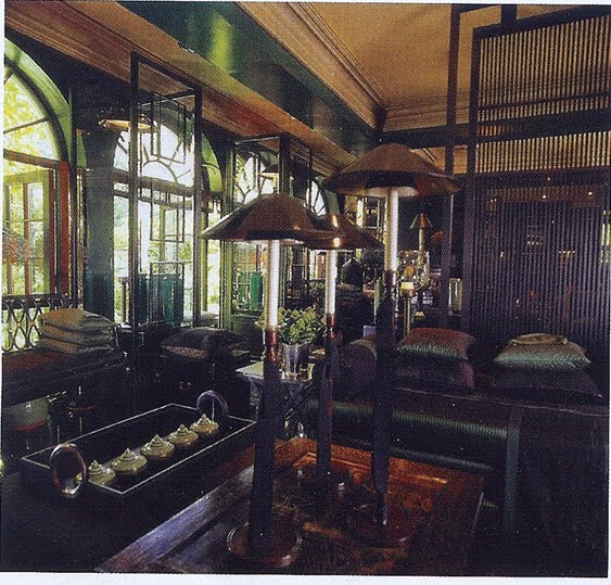
Gorgeous? Of course it is. But this contrary to all appearances is not the General Trading Company on Sloane Sq.

Or the new Nouveau Orientalist galleries at the V & A (I made that up)
No, it 's a house, a residence, a dwelling, a home.
According to a mild piece of hagiography by Min Hogg in February's World of Interiors, it belongs to Anouska Hempel and her long-suffering husband Sir Mark Weinberg. Hempel is a multi-faceted designer and all-round good egg. Unless you have to live with her? The dearth of squashy chairs and sofas in the drawing room is, apparently, resolutely intentional. ' I always sit up straight, never sprawl or loll'. Funny eh, since everywhere you go there are mountain ranges of blooming cushions where presumably you get ticked off for scaling them and even worse, knocking them over.
If I were her house guest, I'd be sure to take out personal accident insurance with third party liability. That's beside the self-denying ordinance. I know somebody who stayed at Blakes, her legendary London boutique hotel, and found it something of an obstacle course.


Very pretty stuff, but it resembles a set for a film about a well-heeled compulsive(Sleuth, maybe). It would be difficult for actual people to inhabit that space, unless all they did was sit around and gawk all day.Is that really a bed, or a catafalque for the Pope? Even a strictly vanilla couple would have it a shambles after a minute or two of aerobics.
ReplyDeleteYou're right. It looks much more like a meticulously arranged shop.
-rurritable
I can see those jars shaking.. what did I say about insurance?
ReplyDeleteLondon's answer to Kelly Wearstler
ReplyDeletelove me some GTC!
ReplyDeleteso fascinating-destined to be shot-as in photographed again and again. the "one of several dining rooms" is worthy of who Charles I or II? Too many pillows,too too many in the living room is it? I had tea in Blakes Hotel-this is another hotel fantasy. I love your take on it- especially the Nouveau Orientalist Gallery. How I love to Loll'
ReplyDeleteI've not seen the article yet but I feel, and have felt this way for a long time, that Weinstock's interiors would be suffocatingly full of what in the end looks like a collection of chotzskes. I have photos of her first published place and was as underwhelmed when I saw them as I am with these photos.
ReplyDeletei've got to whisper it, I think this woman needs to see a shrink.
ReplyDeleteI've been to Blakes. Seen several rooms and was impressed by their
ReplyDeletecomplete disregard for comfort and logic. Mannered effects bordering
on the sinister. Anouska Hempel is another of those designers whose
celebrity is utterly unfathomable. In fact her work represents everything
I loathe in Interior Decoration~the piling on of meaningless effects, the crowded table tops, the upscale boutique atmosphere. Yet I know of people who go into positive raptures over it.
Oh thank you, thank you Mr Worthington. You've absolutely nailed it. 'Mannered effects bordering on the sinister.. meaningless.. '. Gorgeous. Nothing more to be said.
ReplyDeleteHemple really should be running a theme park. Preferably one far, far away.
ReplyDeleteThanks ALL for saying things I'd like to have done
ReplyDeleteI totally agree with Mr Worthington and HOBAC.
ReplyDeleteYes, it would make a beautiful movie setiting, but for real life..... ?
ReplyDeleteAgree with Mr. Worthington and HOBAC completely. Do think she is on par with KWID here in the states in some way.
Have too, been to Blakes, and was shocked/appalled/bewildered that I spent so much for such a lovely, yet vacuouis experience. It's a bit like looking for the prize in the cracker box, not finding it, or worse, fishing it out and realizing it's plastic and cheap, probably broke.
The interiors do look fabulous, but only from a photoshoot perspective, or as a window at Harrods or GTC, (when it was any good - what happened to that by the way?). But yes too contrived. Kelly Hoppen has the same problem too in the pillow/cushion department, and whilst her seating may be more comfortable, her style too is contrived.
ReplyDeletei want to call a truce on 'cairns' of cushions. Been there, done that. Not me, I mean, i've always hated them!
ReplyDeleteIn my view Hempel ranks amongst the worst of the "great" lady decorators (at least the ones featured in the mags), right up there with Clodagh and Muriel Brandolini. I don't "get" any of their work, all of which seems to me to be spectacularly uncomfortable-looking, often ugly, and certainly idiotic.
ReplyDeleteDear Rose,
ReplyDeleteSoemthing horrible happened today, any my Talitha Love has disappeared from the blogsphere. I have tried in vain to discover why. I have started a new account using my professional working name, Thea Beasley, theabeasley@gmail.com. I hope you will update and stay in touch.
Regards, Talitha/Thea